Date: February 20th 2026
Description:
This app was created for the purpose of displaying the potential of ArcGIS Online in aiding the BBC's work. This map aims to emphasise the discrepancy in life expectancy between areas with low deprivation and high deprivation levels. The Index of Multiple Deprivation layer (Esri UK) is duplicated in order to edit the appearance of the legend without editing the visible layer. The edits made to the legend are 1. reversing the order of the labels, so that the most deprived areas (1) are on the top, and 2. adding the notes (most deprived) and (least deprived) 1st and 10th values respectively.
More information is available here: View the App Item Page
The web map is available here: View the Web Map
The information is sourced from the layer published by Esri UK of Multiple Deprivation Index in England for 2025, and The Met Office's layer of SSP: Life expectancy using data for 2030 and SSP2 (middle-of-the-road scenario).
Date: December 4th 2025
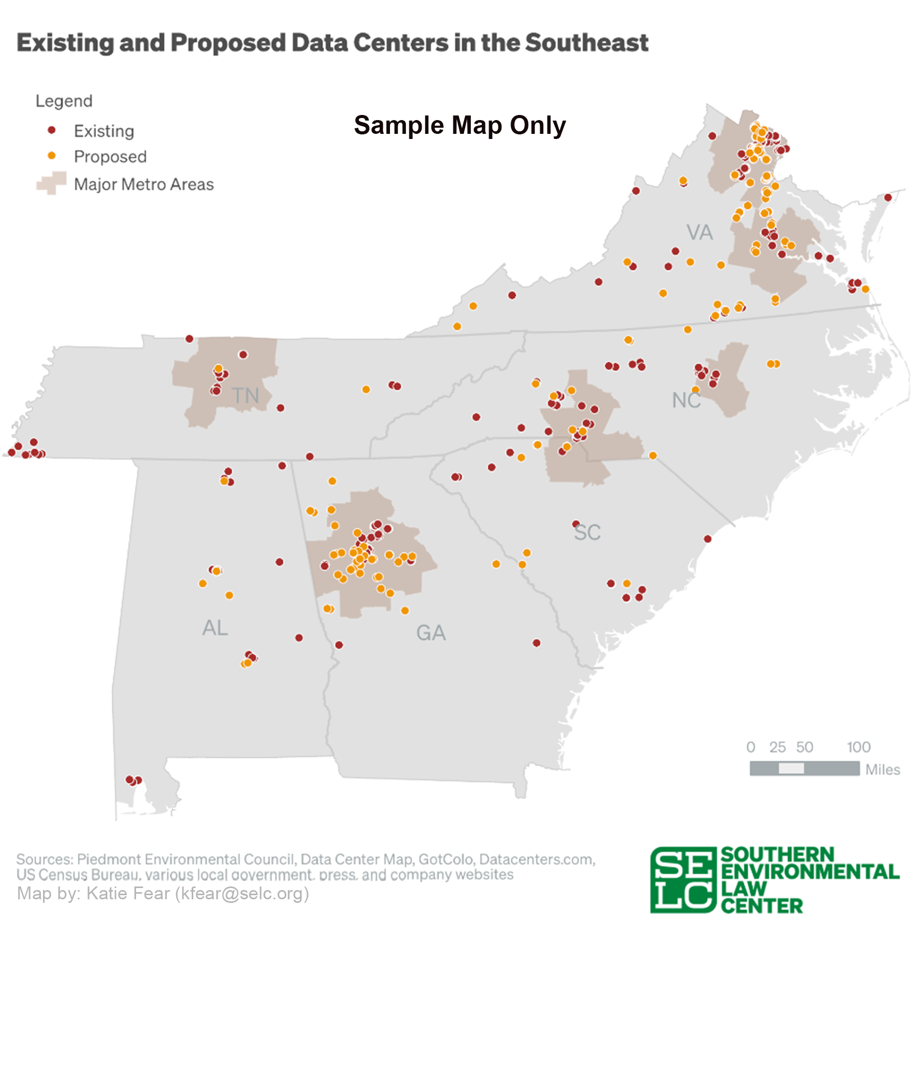
Description:
This map shows the distribution of data centers throughout the American South (specifically the 6 states in which SELC operates). The purpose of this map is to visualize where data centers are being constructed, with the end goal of understanding how local energy grids will be impacted as this sector continues to grow.
Date: October 10th 2025
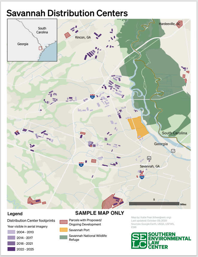
Description:
This map shows the distribution of warehouses in Savannah, GA, and their date of construction. The purpose of this map is to show how the port expansion impacted construction in the surrounding area.
Date: July 12th 2025
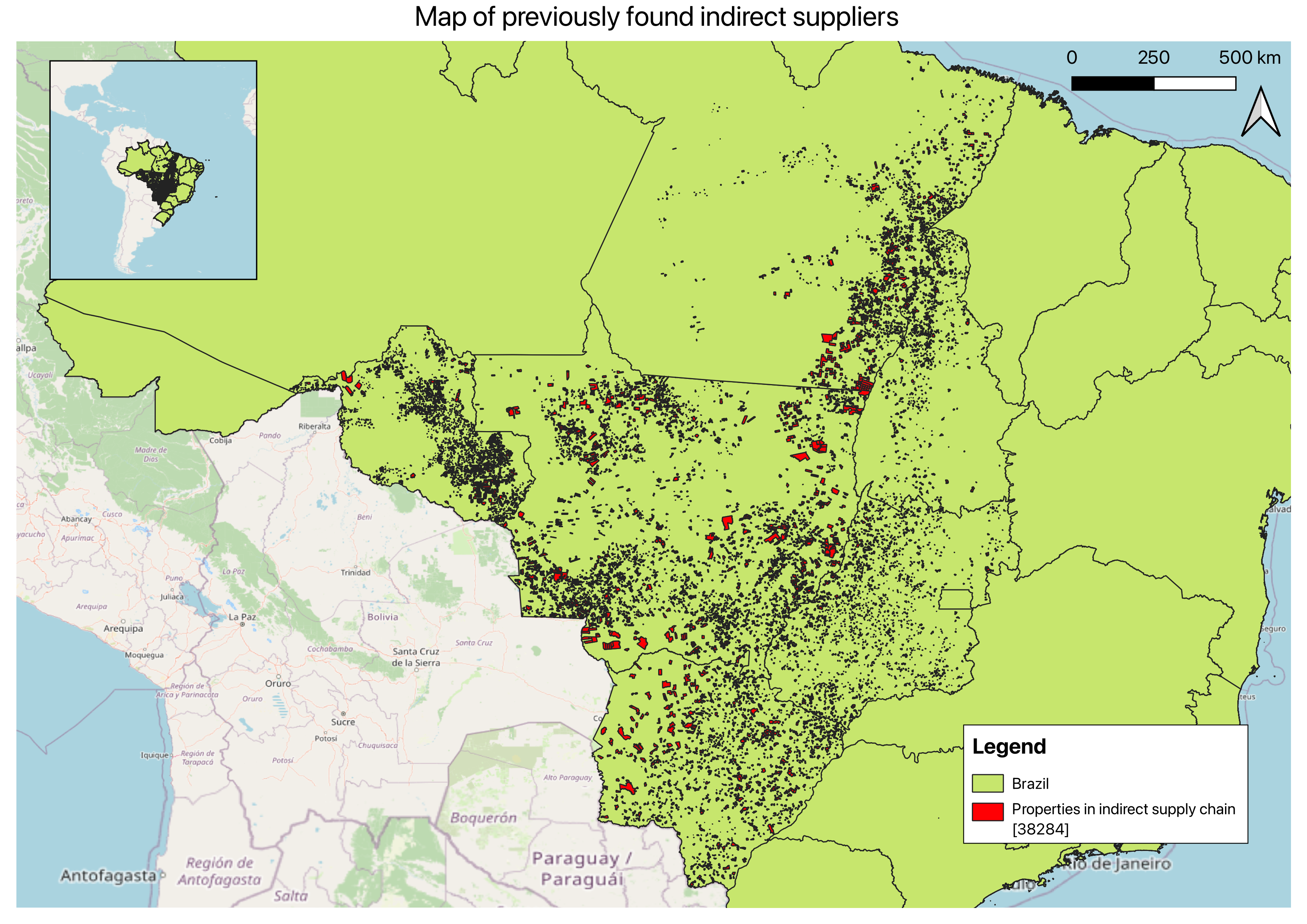
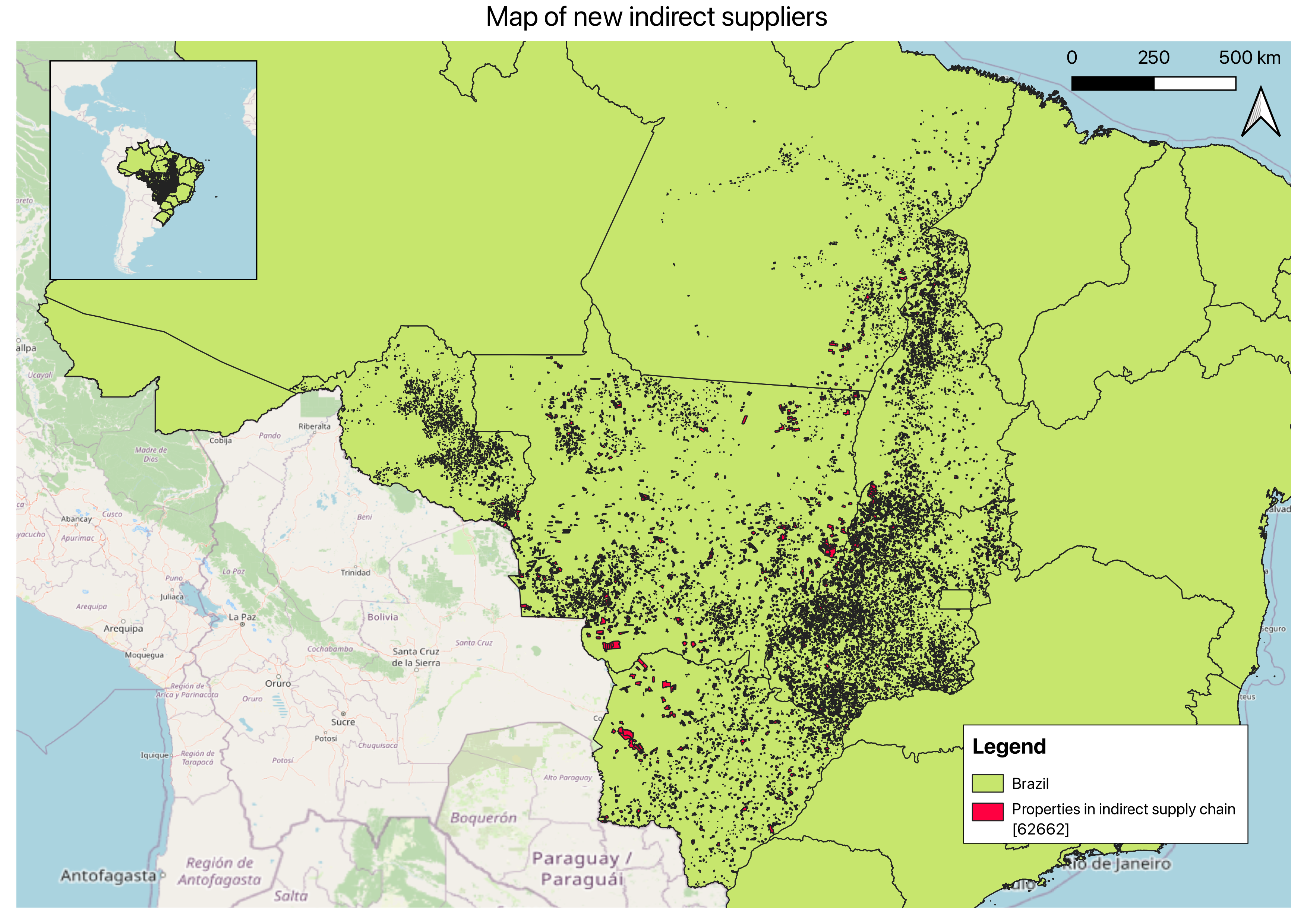
Description:
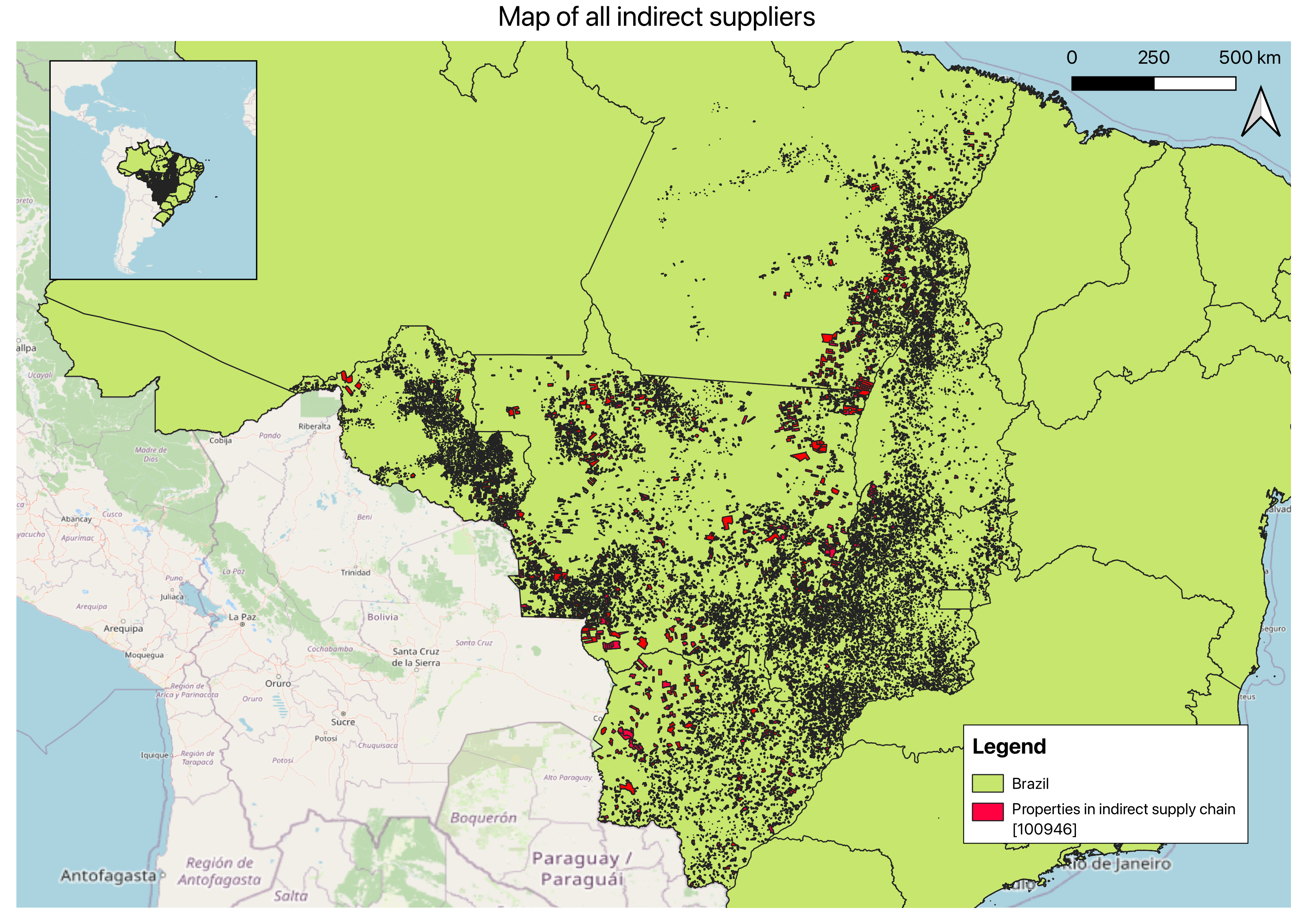
This was the map output of my summer internship with AidEnvironment. I used both R and Python workflows to improve and automate the cleaning and processing of cadastre data and animal transport records in Brazil, in order to find indirect suppliers in the beef supply chain.
Date: April 29th 2025
Description:
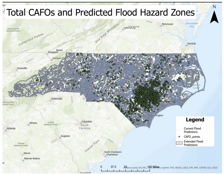
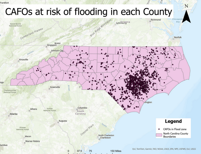
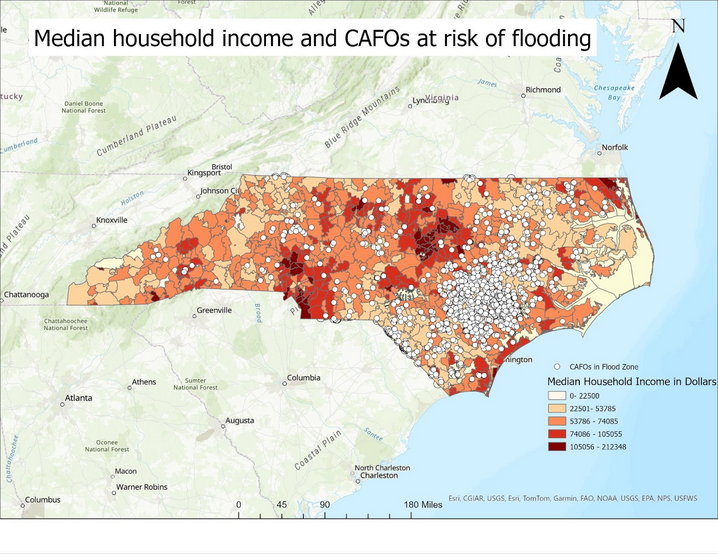
In this project, I focused on using Python and R to conduct an analysis of the socioeconomic status of those most at risk from polluted flood waters. I used the library arcpy to execute this project, as well as R to clean my data. I took current flood prediction maps and added a buffer around them to account for increased flood severity resulting from climate change. I then added a point file with the locations of the concentrated animal feeding operations (CAFOs) in North Carolina, and used the clip tool to select the CAFOs that were within the flood zones. Then, I joined socioeconomic data with a zipcode shape file and used the overlay tool to analyse the socioeconomic groups most at risk of pollution from CAFO flooding.
Date: April 22nd 2025
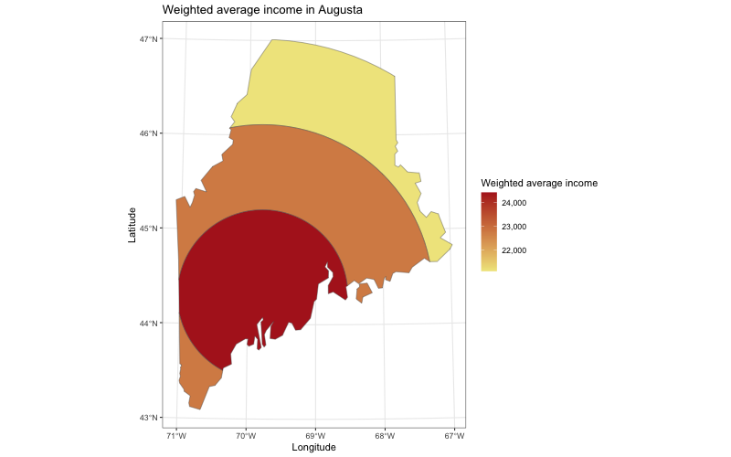
Description:
In this project, I used R to create a map of the variation in average income in Georgia, using ring buffers representing the distance from Augusta. The average income in each ring is weighted by the area of the income polygons it contains, ensuring larger regions have a proportionate influence. . The code for this map can be found on my GitHub, as well as linked on the code page of this website.
Date: April 20th 2025
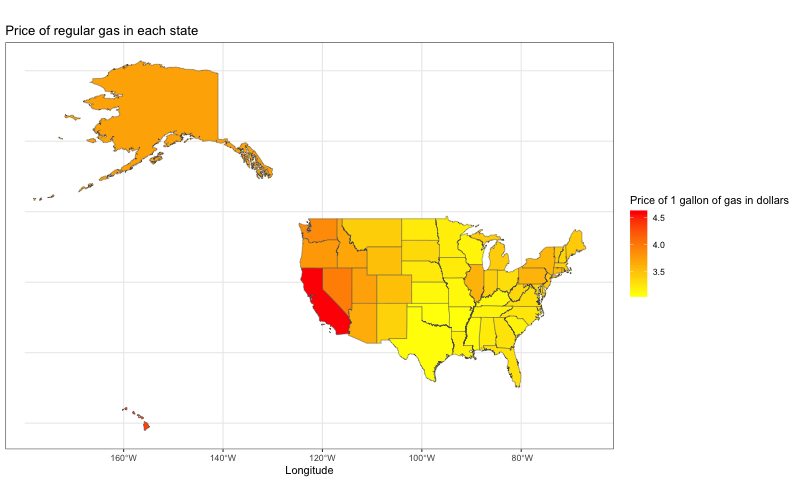
Description:
In this project, I used R to create a map of the variation in gas prices by state, the code for this map is found on my github and linked on the code page of this website.
Date: November 13th 2024
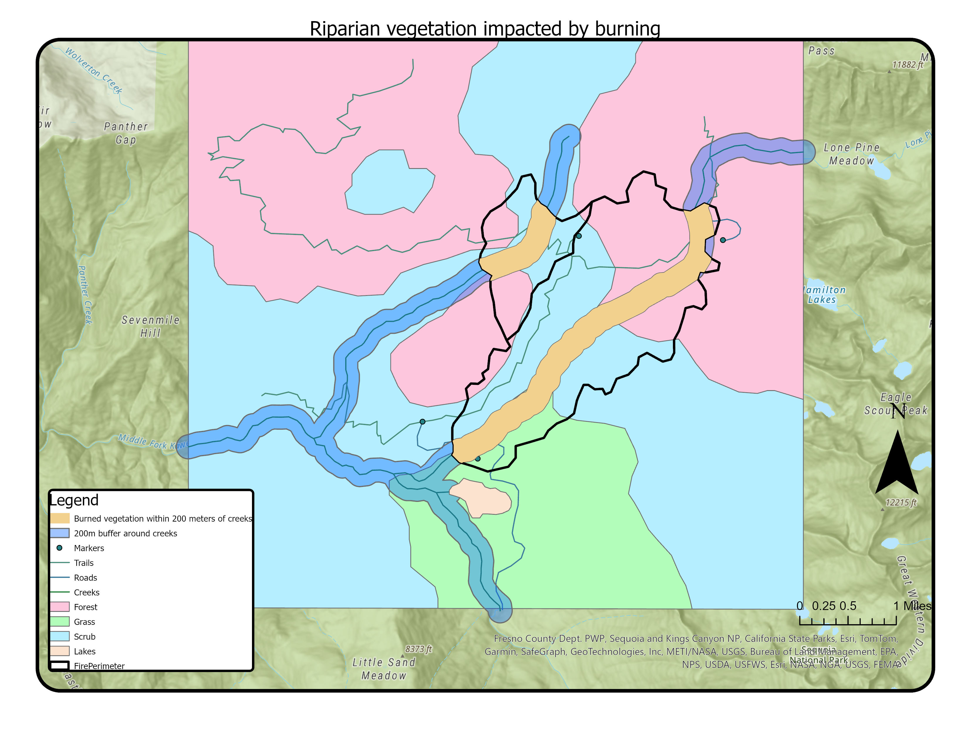
Description:
In this project, I used the buffer and intersect tools to highlight the vegetation within 200m of a creek that was impacted by burning
Date: November 6th 2024
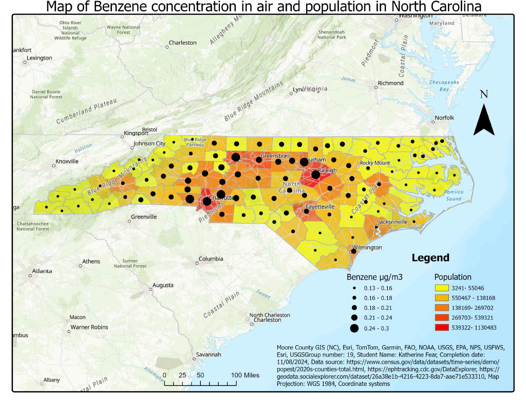
Description
In this project, I created a map representing the Benzene levels in the air compared to the population of each county in North Carolina
Date: October 2nd 2024
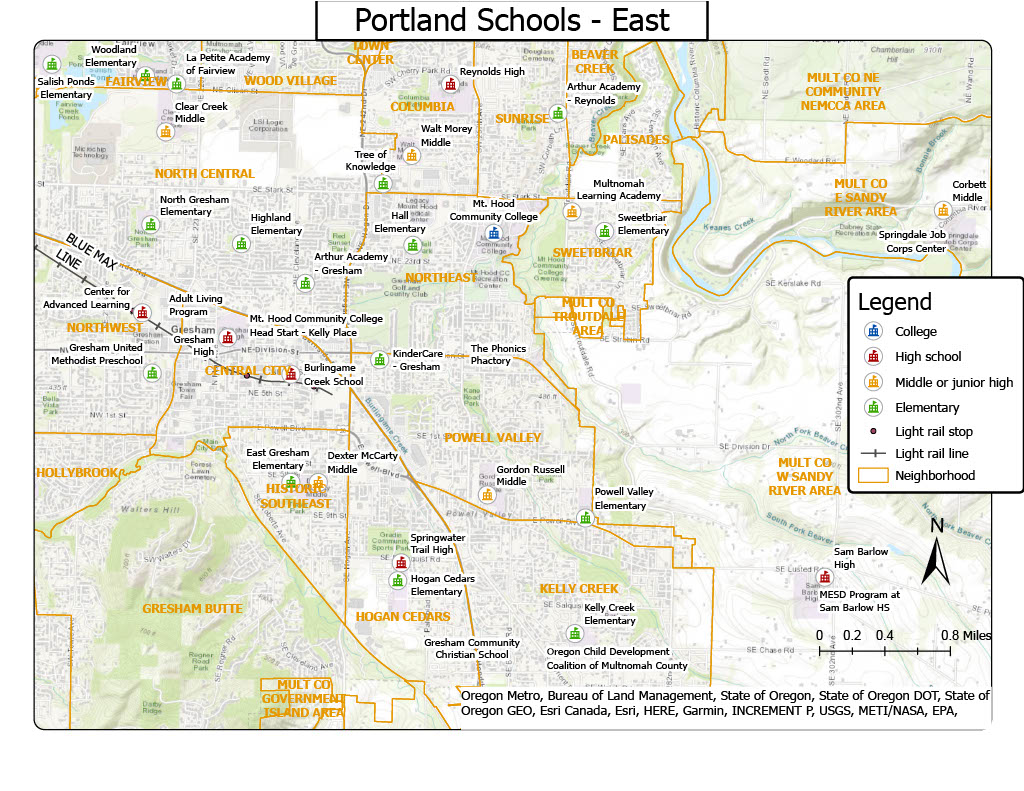
In this project I practiced using symbols and legends to represent schools within a region of Portland, Oregon